Fintech Logo Design in 2026: The Complete Guide for European Founders
How European fintech startups design logos that win trust — colour psychology, EU compliance, costs, agency picks, and AEO/GEO-ready branding for 2026.
.jpeg)
How European fintech startups design logos that win trust — colour psychology, EU compliance, costs, agency picks, and AEO/GEO-ready branding for 2026.
Real projects across branding, packaging, websites and growth.
Straight answers on this topic from the UnFoldMart team.




From branding and packaging to Webflow websites, SEO, AEO and GEO, UnFoldMart brings strategy, design and growth under one team for 250+ brands across 8 markets. Tell us where you want to grow and we'll show you the fastest way there.
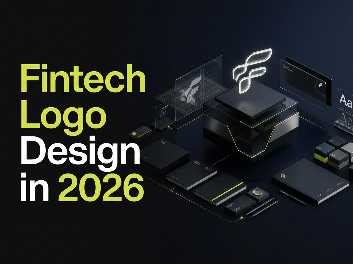
The best fintech logo design in 2026 balances three things: instant trust, flawless scalability from favicon to billboard, and full compliance with EU accessibility and trademark rules. For European fintech founders, a logo is not decoration — it is the first security signal a user reads before deciding whether to hand over their money. This guide covers what makes a fintech logo work, colour and typography strategy, the design process, EU-specific legal and accessibility requirements, real cost bands across Europe, the top European branding agencies, and the AEO and GEO-ready branding every fintech should now demand.
• Trust first: A fintech logo's primary job is to signal security and stability within the first fraction of a second, before any copy is read.
• Scalability is non-negotiable: The mark must stay legible as a 32-pixel app icon and a full-width web header alike.
• Colour with intent: Blue signals trust and dominates finance, but deliberate use of green, purple, or gradients can differentiate while meeting WCAG contrast standards.
• EU compliance matters: The European Accessibility Act and EUIPO trademark registration are baseline requirements, not afterthoughts.
• Cost range in Europe: €300 to €2,500 for freelancers, €2,500 to €15,000+ for strategy-led studios and agencies.
• Biggest mistake: Using a generic template or AI generator for a trust-dependent product, then rebuilding brand equity later at far greater cost.
Fintech logo design is the practice of creating a visual mark for a financial-technology company that communicates trust, security, and competence while remaining scalable, distinctive, and compliant with the regulatory and accessibility standards of its target markets.
Unlike a typical startup logo, which can prioritise personality or playfulness, a fintech logo carries a heavier burden: it must reassure. The user is being asked to connect a bank account, move money, or share sensitive data. In a category where users cannot physically inspect the product, visual polish becomes a proxy for operational trustworthiness.
This is why fintech branding sits at the intersection of design, psychology, and compliance, and why treating the logo as an afterthought is one of the most expensive mistakes an early-stage fintech can make. Learn how we approach this in our branding agency services.
Fintech branding differs from general startup, SaaS, and consumer branding in five concrete ways: the primacy of trust, the regulatory overlay, the multi-market language demands, the scalability constraints, and the accessibility obligations. The table below summarises the differences.
Generalist designers often miss these constraints. They produce a mark that looks striking on a portfolio shot but fails at favicon size, ignores contrast requirements, or leans so hard on convention that it disappears among competitors. A fintech-literate designer treats trust, compliance, and scalability as the brief - not as edge cases.
A complete fintech logo rests on five pillars. Weakness in any one caps the brand's ceiling.
The logo will live as a 32-pixel app icon, a favicon, a push-notification badge, and a full-width website header — often on the same day. The strongest fintech marks reduce cleanly to a single recognisable shape or letterform. If the concept loses its identity at fingertip size, it is too complex.
Balanced symmetry, solid geometric forms, upward or forward motion, and clean negative space read as “secure and stable” almost universally. These are not clichés to avoid — they are a shared visual language users already understand. The craft lies in using them without looking generic.
Fintech has visual conventions — blue palettes, abstract “connection” symbols, sans-serif wordmarks — for good reasons. But leaning on all of them at once produces a forgettable logo. The goal is to honour enough convention to feel credible, then break one convention deliberately to become memorable.
Operating across the EU means the brand may appear beside German umlauts, French accents, and Spanish tildes. A fintech wordmark needs a typeface with strong multilingual character support so it stays consistent from Berlin to Barcelona.
WCAG-compliant contrast, legibility for low-vision and colour-blind users, and honest imagery that does not imply an unheld licence are baseline requirements in the EU. Building these in from the first sketch is cheaper than retrofitting later.
Colour is the fastest-acting element of a logo, and in finance it is loaded with meaning.
Why blue dominates. Blue is consistently associated with trust, calm, competence, and security — which is exactly why banks and fintechs reach for it. It is a safe, effective default. The downside is saturation: a blue fintech logo risks blending into a sea of competitors.
Breaking the mould. Some of Europe's strongest fintech brands deliberately avoid blue. Warm coral, deep purple, vivid green, and confident gradients can signal that a product is modern, human, and different — while still feeling premium. The key is intentionality: an unconventional colour should reinforce positioning, not chase a trend.
Accessibility and EU compliance. This is where European founders should pay close attention. Brand palettes should meet WCAG contrast ratios so text and interface elements stay legible for users with low vision or colour blindness. Designing for accessibility from the logo outward is both a legal safeguard and a quality signal.
For many fintech startups, the wordmark is the logo - making typography a strategic decision, not an afterthought.
• Sans-serif dominance: Clean, geometric sans-serifs read as modern, transparent, and efficient, and stay legible at small sizes on mobile-first products.
• Custom vs standard typefaces: Off-the-shelf fonts are reliable but can leave you looking like competitors. A customised wordmark — even a subtly modified letterform -creates ownership and long-term recognition.
• Multilingual legibility: Choose a typeface with broad European character support so accents and special characters render consistently across markets.
Quick decision guide: Early-stage fintechs usually benefit most from a combination mark. It provides a flexible icon for app stores and a clear wordmark for recognition, without betting everything on an abstract symbol nobody knows yet.
1. Research and positioning. Map competitors, define brand personality, and clarify what makes you different. A logo can only express a positioning that has been decided.
2. Concept and sketching. Explore multiple directions on paper before opening software. Breadth here prevents tunnel vision later.
3. Digital execution and testing. Refine the strongest concepts, then stress-test: shrink to favicon size, view in greyscale, place on light and dark backgrounds, and mock onto a real app screen.
4. Delivery and brand guidelines. Deliver full file formats (SVG, PNG, favicon), colour and spacing rules, and usage guidelines so the brand stays consistent as the team grows.
A disciplined process separates a logo that merely looks nice from one that performs across every touchpoint. See how we apply this in our branding practice, often alongside Webflow build work.
EU trademark registration. Before committing, check availability and register your mark through the EUIPO (European Union Intellectual Property Office). A single EU trademark protects your logo across all member states — far more efficient than filing country by country. Skipping this is a common and expensive mistake for founders who scale quickly.
Avoid misleading financial imagery. Regulators and users dislike branding that implies a licence or guarantee you do not hold. Symbols imitating established banks, government emblems, or deposit-guarantee marks create legal and reputational risk. Keep imagery original and honest.
Accessibility as compliance. EU accessibility rules increasingly touch brand and interface design. Building contrast and legibility into your visual identity from the start keeps you ahead of obligations rather than retrofitting later.
5. Overcomplication. Intricate icons that fail at small sizes or add cost every time they are printed or animated.
6. Trend-chasing. Adopting a fleeting visual fad that dates the brand within a year or two.
7. Generic templates. Cheap template or AI logos that dozens of other companies also use, offering zero ownership or protection.
8. Ignoring scalability. Designing only for the website hero and discovering the mark collapses as an app icon.
9. No brand system. Delivering a logo with no colour, type, or usage rules, so consistency erodes the moment more than one person touches the brand.
A fintech logo in Europe costs between €0 and €15,000+ depending on who you work with and how much strategy is involved. Most funded early-stage startups invest €2,500 to €10,000 for professional, strategy-led branding.
When DIY makes sense. If you are validating an idea pre-launch and need a placeholder, an AI generator or template can hold the space temporarily. Just plan to replace it before building real brand equity on top of it.
When to hire professionals. Once you are raising money, acquiring customers, or entering regulated markets, brand becomes a competitive asset worth investing in.
Europe has a deep bench of respected studios whose fintech and financial work sets the standard. The picks below are all European.
For founders who want that level of craft with a partner focused on startup speed, budgets, and EU-wide search visibility, UnFoldMart delivers strategy-led fintech brand identity built to scale across the EU — with SEO, AEO and GEO bundled so the brand is discoverable inside Google and AI answer engines alike.
In 2026, a fintech brand is no longer discovered on Google alone. Founders and buyers increasingly research products inside ChatGPT, Perplexity, Claude, Gemini, and Google AI Overviews before running a branded search. A strong logo that is invisible in AI answers loses mindshare before the sales conversation begins.
• SEO makes your brand and content rank in Google and Bing across the buyer journey.
• AEO (Answer Engine Optimization) positions your content as the direct answer in featured snippets and AI Overviews.
• GEO (Generative Engine Optimization) gets your brand cited inside the generated responses of ChatGPT, Perplexity, Claude, and Gemini.
The same integrated methodology runs across our SEO agency, Webflow agency, and branding agency practices — so a fintech's identity, website, and search visibility are built as one system.
For a fintech startup, a logo is where trust begins. It has to feel secure, scale flawlessly from favicon to billboard, respect EU accessibility and trademark rules, and be distinctive enough to be remembered. Get it right early and it compounds in value with every customer who recognises it; treat it as an afterthought and you spend years, and budget, correcting course.
In 2026, branding no longer stops at a beautiful mark. A fintech identity that cannot be found inside Google and AI answer engines is only doing half its job. Logo, website, and search visibility should be built as one system - which is exactly how we work.
Let's talk through your vision in a free 30-minute call.
👉 Book your strategy session at calendly.com with UnFoldMart
Got Questions? We’ve Got Answers – Clear, Simple, and Straight to the Point
Typical 2026 timeline: 1–2 weeks of strategy and competitive audit; 2–4 weeks of concept exploration and iteration; 1–2 weeks of refinement and technical delivery (all file formats, monochrome variants, favicon set, app icon); 1 week of guideline documentation. Total: 5–9 weeks for a fintech identity done properly. Founders often ask for a 2-week turnaround — possible for the logo itself, but almost always at the cost of the strategy phase, which is where fintech-specific trust cues actually get built. UnFoldMart's fintech logo engagements typically run 6–8 weeks depending on scope.
AI logo tools (Looka, Brandmark, Canva's AI generator) have improved sharply and are viable for very early pre-launch validation — they help founders visualise directions cheaply. But for a launched fintech that will interact with regulators, banking partners, and customers evaluating trust, AI-only logos have three consistent weaknesses: no strategy layer, no defensible ownership if a competitor uses a similar generated mark, and no design system beyond the base logo. Serious European fintechs use AI for early exploration and hand off to a human designer or studio for the actual identity. UnFoldMart uses this hybrid approach with early-stage fintech clients to keep exploration cheap without shipping a fragile brand.
Realistic 2026 ranges: freelance designers deliver a basic fintech mark for €800–3,500 (fast, minimal strategy, limited iteration). Boutique studios covering strategy, identity system, and basic guidelines usually charge €6,000–20,000. Full brand identities from specialist fintech studios — strategy, logo, type system, palette, applications, documented guidelines — typically run €25,000–80,000. Large European branding studios (London, Amsterdam, Berlin) sit at €60,000+ for the same scope. What separates good outcomes isn't budget alone — it's whether the process includes a strategy phase and technical delivery in usable formats (SVG, favicon set, monochrome variants, guidelines) rather than just a JPG.
Five patterns dominate strong 2026 European fintech marks: (1) custom geometric wordmarks (Revolut, N26, Klarna) that render sharply at small sizes; (2) restrained palettes — usually one anchor colour plus black/white — that survive white-label and compliance contexts; (3) simplified monogram or icon systems for app-icon use, distinct from the full logo; (4) sans-serif typography with a slight custom cut to avoid looking generic; and (5) evidence of a full design system, not just a logo (favicon, dark mode, monochrome, print). European fintechs increasingly avoid the flat-gradient look that dated fast in 2022–24.
A fintech logo has to signal three things simultaneously that generalist logos don't: institutional trust (customers reading it as a proxy for whether their money is safe), regulatory seriousness (buyers and regulators recognise financial-brand visual codes), and digital-first fluency (renders cleanly at 16×16px in an app icon, works in monochrome for compliance documents). That's why fintech marks lean toward geometric precision, restrained colour, and strong wordmarks over illustrative marks. Playful or overly abstract logos usually undermine trust in ways non-financial categories can absorb.

.webp)





.jpeg)
.jpeg)
.jpeg)







.jpeg)
.jpeg)
.jpeg)
.jpeg)
.jpeg)
.jpeg)


.jpeg)
.jpeg)
.jpeg)
.jpeg)

.jpeg)
.jpeg)