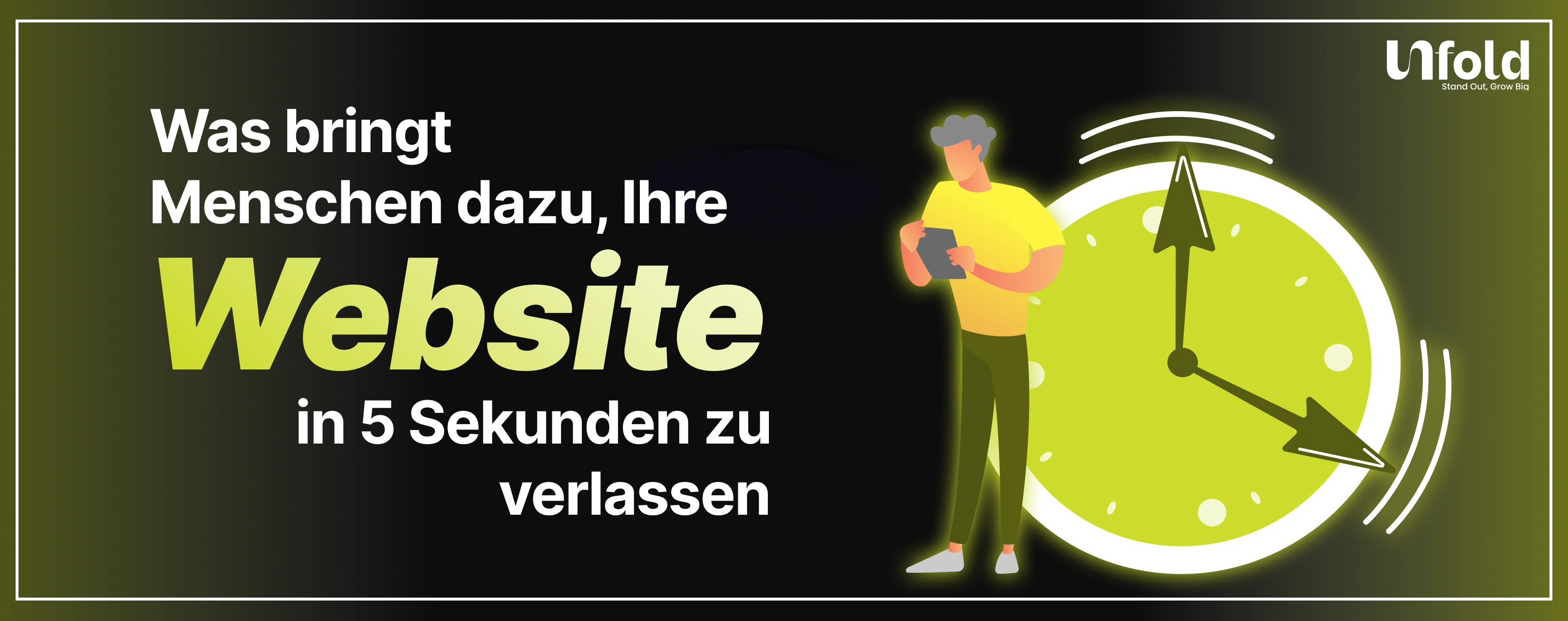
Was bringt Menschen dazu, Ihre Website in 5 Sekunden zu verlassen?
You worked hard to bring people to your website.
Ads, SEO, social media, referrals. The traffic is there. But most visitors leave almost instantly.
Not in minutes.
Not after scrolling.
In five seconds or less.
This is not because users are impatient. It is because your website failed to answer one simple question fast enough:
“Is this for me?”
If the answer is not immediately clear, people leave. Understanding why this happens is the first step to fixing it.
The 5 Second Rule of Websites
Research consistently shows that users form an opinion about a website almost instantly. Within a few seconds, they decide whether to stay or leave.
In those first moments, visitors are not reading paragraphs or analyzing features. They are scanning.
They are looking for:
- Clarity
- Relevance
- Trust
- Ease
If your site feels confusing, slow, or untrustworthy, they do not wait around.
First impressions decide everything.
What the 5 Second Test Really Measures
The famous 5 second test is not about design beauty. It measures comprehension.
After five seconds, a user should be able to answer:
- What does this company do?
- Is this relevant to me?
- What should I do next?
If users cannot answer these questions quickly, the website has already failed, no matter how good the product is.
Most high bounce rates are clarity problems, not traffic problems.
Unclear Value Proposition
This is the biggest reason people leave.
If your headline is vague, clever, or filled with jargon, users will not work to understand it.
Statements like:
- “Innovating the future of digital solutions”
- “Empowering growth through technology”
- “A platform for next-generation success”
Mean nothing to a first-time visitor.
Your value proposition must clearly explain who you help and how in one glance. If users have to scroll to understand what you do, you are already losing them.
Poor Visual Hierarchy and Design Overload
When everything screams for attention, nothing gets attention.
Many websites overwhelm users with:
- Too many colors
- Multiple competing headlines
- Excessive animations
- Large blocks of text
- No clear focal point
This creates cognitive overload.
Users should immediately see:
- A clear headline
- A supporting explanation
- A primary call to action
If the eye does not know where to go first, the user leaves.
Slow Page Load and Performance Issues
Speed is non-negotiable.
If your website takes more than a few seconds to load, many users will leave before they even see your content. This is especially true on mobile.
Slow sites signal:
- Poor quality
- Outdated technology
- Lack of professionalism
Even a great design cannot compensate for slow performance. Speed is part of user experience, not a technical detail.
Lack of Trust Signals
Visitors are cautious.
They do not know you. They do not trust you yet. If your website does not help them feel safe, they leave.
Common missing trust signals include:
- No social proof
- No client logos or testimonials
- No clear about page
- No contact information
- No credibility indicators
People look for reassurance subconsciously. Without it, hesitation turns into exit.
Mismatch Between Ads and Landing Pages
If users arrive from an ad or search result and the page does not match their expectation, they bounce immediately.
This happens when:
- The headline does not reflect the ad message
- The offer feels different
- The intent changes from informational to sales-heavy
- The design feels inconsistent
This breaks trust instantly.
Message continuity between traffic source and landing page is critical for retention.
Poor Mobile Experience
Most traffic today is mobile, yet many websites are still designed desktop-first.
Common mobile issues include:
- Text that is too small
- Buttons that are hard to tap
- Content cut off or misaligned
- Slow mobile load times
- Popups covering the screen
If mobile users struggle even slightly, they leave. They will not pinch, zoom, or fight your layout.
Mobile experience is first impression experience.
Aggressive Popups and Interruptions
Nothing frustrates users faster than being interrupted before they understand the page.
Popups that appear immediately asking for:
- Email signups
- Cookie consent overload
- Chat prompts
- Discounts
Disrupt the natural flow.
Bevor du um Aufmerksamkeit bittest, musst du sie dir verdienen. Frühe Unterbrechungen fühlen sich aufdringlich und verzweifelt an, was die Leute abschreckt.
Unübersichtliche Navigation und kein klarer nächster Schritt
Auch wenn den Nutzern gefällt, was sie sehen, können sie es trotzdem verlassen, wenn sie nicht wissen, was sie als Nächstes tun sollen.
Zu den häufigsten Problemen gehören:
- Zu viele Menüpunkte
- Vage Navigationsbeschriftungen
- Kein primärer Aufruf zum Handeln
- Mehrere konkurrierende CTAs
Benutzer wollen nicht nachdenken. Sie wollen Führung.
Ein klarer Weg nach vorne sorgt dafür, dass die Nutzer auch nach den ersten Sekunden beschäftigt bleiben.
So diagnostizieren Sie Drop-Offs innerhalb von 5 Sekunden
Um schnelle Ausfahrten zu beheben, müssen Sie das Verhalten beobachten und nicht raten.
Zu den nützlichen Methoden gehören:
- Heatmaps, um zu sehen, worauf sich die Nutzer konzentrieren
- Sitzungsaufzeichnungen zum Ansehen von Interaktionen
- Analytik zur Identifizierung von Seiten mit hoher Absprungrate
- Der 5-Sekunden-Test mit echten Nutzern
Stellen Sie den Testern eine Frage:
„Worum geht es Ihrer Meinung nach auf dieser Website?“
Wenn ihre Antwort nicht Ihrer Absicht entspricht, haben Sie das Problem gefunden.
Schnelle Lösungen, die den ersten Eindruck verbessern
Sie benötigen nicht immer ein vollständiges Redesign.
Zu den wichtigsten Korrekturen gehören:
- Schreiben Sie Ihre Hauptüberschrift aus Gründen der Klarheit um
- Vereinfachen Sie den Bereich, der über dem Zusammenklappen sichtbar ist
- Unnötige Elemente entfernen
- Verbessern Sie Kontrast und Lesbarkeit
- Fügen Sie ein starkes Vertrauenssignal hinzu
- Popups verzögern
Kleine Verbesserungen der Klarheit führen oft zu großen Ergebnissen.
Warum Klarheit in den ersten 5 Sekunden Kreativität übertrifft
Kreativität ist wichtig, aber erst nach Klarheit.
Nutzer belohnen Klugheit nicht, wenn sie verwirrt sind. Sie belohnen Verständnis.
In den ersten fünf Sekunden geht es darum, grundlegende Fragen zu beantworten. Kreativität kommt erst später zum Vorschein, wenn Vertrauen aufgebaut ist.
Die besten Websites fühlen sich offensichtlich an, nicht beeindruckend.
Fazit: Die Leute gehen, weil du es nicht einfach gemacht hast
Benutzer gehen nicht, weil sie ungeduldig sind.
Sie gehen, weil:
- Sie verstehen dich nicht
- Sie vertrauen dir nicht
- Sie wissen nicht, was sie tun sollen
Wenn Sie diese drei Dinge korrigieren, sinken die Absprungraten auf natürliche Weise.
Ihre Website muss nicht alles schnell sagen.
Es muss nur sagen, dass richtige Sache schnell.
Sie möchten ein Audit durchführen lassen?
Wenn Benutzer Ihre Website innerhalb von Sekunden verlassen, ist das Problem nicht der Traffic.
Es ist Erfahrung.
Bei UnfoldMart, wir helfen Marken dabei, Probleme in Bezug auf Klarheit, Vertrauen und Nutzerfreundlichkeit zu beheben, die im Hintergrund Konversionen zum Erliegen bringen.
👉 Holen Sie sich ein UX- und Konversions-Audit Ihrer Website und machen Sie Besucher zu Kunden.

.jpeg)

FAQs
Got Questions? We’ve Got Answers – Clear, Simple, and Straight to the Point

Möchten Sie Ihre Marke in einen skalierbaren Wachstumsmotor verwandeln?
Wir helfen modernen Unternehmen dabei, Branding, Websites, SEO und Paid Media in einem leistungsorientierten System zu vereinen, das skalierbar ist.