Mimi Crunch
Overview
Mimi Crunch is a health-focused food brand built around millet-based staples designed for modern, everyday consumption. The brand needed a cohesive packaging system that could clearly differentiate multiple SKUs while maintaining a unified, trustworthy, and family-friendly identity.
UnFoldMart partnered with Mimi Crunch to design a scalable packaging system that balances nutrition-led communication with a clean, contemporary visual language.
The Challenge
Mimi Crunch offers a wide range of millet products, including flours, ready-to-cook mixes, and whole grains. The key challenges were:
- Creating clear differentiation across multiple product variants
- Maintaining strong brand recognition across shelves and online
- Communicating health benefits without clutter
- Designing packaging that appeals to both parents and health-conscious consumers
The packaging needed to feel wholesome and modern, without looking generic or medicinal.
Our Approach
We approached Mimi Crunch as a system-first packaging project.
Instead of designing individual packs in isolation, we built a flexible visual framework that could expand across categories while staying instantly recognizable.
Our approach focused on:
- Consistent brand hierarchy and layout
- Color-coded differentiation for easy product identification
- Clean typography for readability and trust
- Subtle illustrations that reinforce natural, grain-based origins
Every design decision was made to simplify choice for the consumer.
The Execution
Packaging Design System
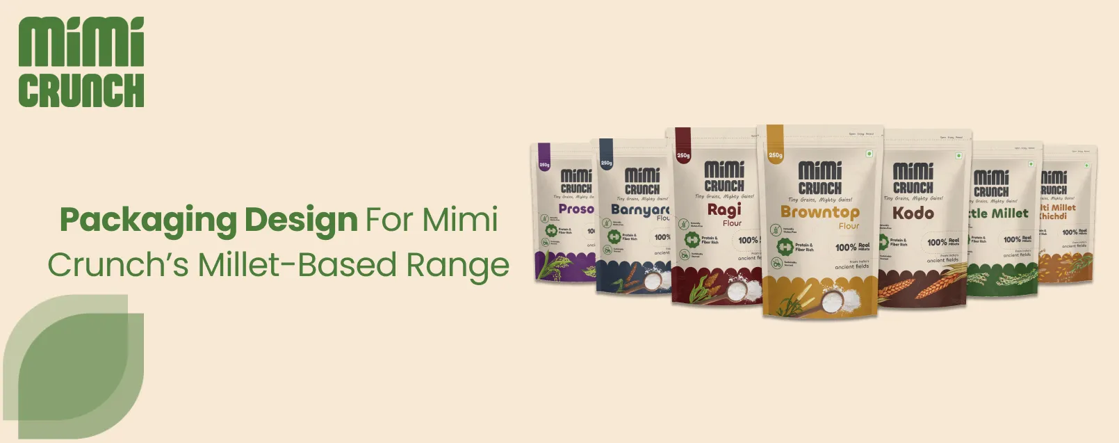
We created a unified packaging structure that remains consistent across all SKUs while allowing each product to stand out through color and naming.
Key design elements included:
- Strong product name visibility
- Clear nutritional cues and benefit highlights
- Soft, earthy color palettes aligned with natural ingredients
- Minimal yet friendly visual language suitable for daily consumption
This system allows Mimi Crunch to introduce new products without redesigning from scratch.
SKU Differentiation & Scalability
Each product variant was assigned a distinct color identity while maintaining the same layout structure. This makes the range easy to scan both online and on physical shelves.
The packaging system supports:
- Multiple millet categories
- Different pack sizes
- Future product extensions
The Outcome
Mimi Crunch now has a cohesive and scalable packaging system that strengthens brand recognition and improves product clarity.
The brand achieved:
- Clear differentiation across its product range
- A consistent and trustworthy shelf presence
- Packaging that communicates health benefits without overwhelming the consumer
- A flexible system ready for future expansion
The result is packaging that feels approachable, nutritious, and modern.
Services Delivered
- Packaging design system
- SKU-wise packaging design
- Visual hierarchy and layout design
- Color system for product differentiation
- Ready-to-scale packaging framework
Launching a food or FMCG brand?
Let’s design packaging that sells

Want to Turn Your Brand Into a Scalable Growth Engine?
We help modern businesses unify branding, websites, SEO, and paid media into one performance-driven system designed to scale.