

Farm Country Brewing - Branding
Overview
Farm Country Brewing is a Canada-based craft brewery rooted in community, tradition, and high-quality brewing. As the brand evolved, there was a clear need to refine its visual identity to better reflect its philosophy, improve consistency across touchpoints, and create stronger shelf presence for its beers.
UnFoldMart partnered with Farm Country Brewing to refresh the brand identity, redesign the logo system, and create cohesive packaging designs that balance heritage with modern craft appeal.
The Challenge
While the brand had strong values and loyal customers, its visual identity lacked consistency and impact across applications.
Key challenges included:
- An existing logo that needed refinement without losing familiarity
- Packaging that did not fully reflect the brewery’s personality or craftsmanship
- Inconsistent visual language across cans, merchandise, and signage
- The need for a system that could scale across multiple beer variants
The goal was evolution, not reinvention.
Our Approach
We approached the project with deep respect for Farm Country Brewing’s roots.
The focus was on building a clear, timeless brand system that feels authentic, confident, and versatile. We anchored the identity around the brewery’s philosophy of tradition, hard work, and community while introducing a sharper, more structured visual language.
Our approach emphasized:
- Minimal, bold typography
- A restrained, earthy color palette inspired by the brand’s environment
- Strong consistency across logo usage and packaging layouts
The Execution
Logo Redesign
The logo was refined to improve legibility, balance, and adaptability across digital, print, signage, and packaging. Multiple logo variations were developed to ensure flexibility while maintaining brand integrity across light and dark backgrounds, as outlined in the brand guidelines
Key outcomes:
- A strong primary wordmark
- Reversed and single-color logo variations
- Clear usage rules to protect brand consistency
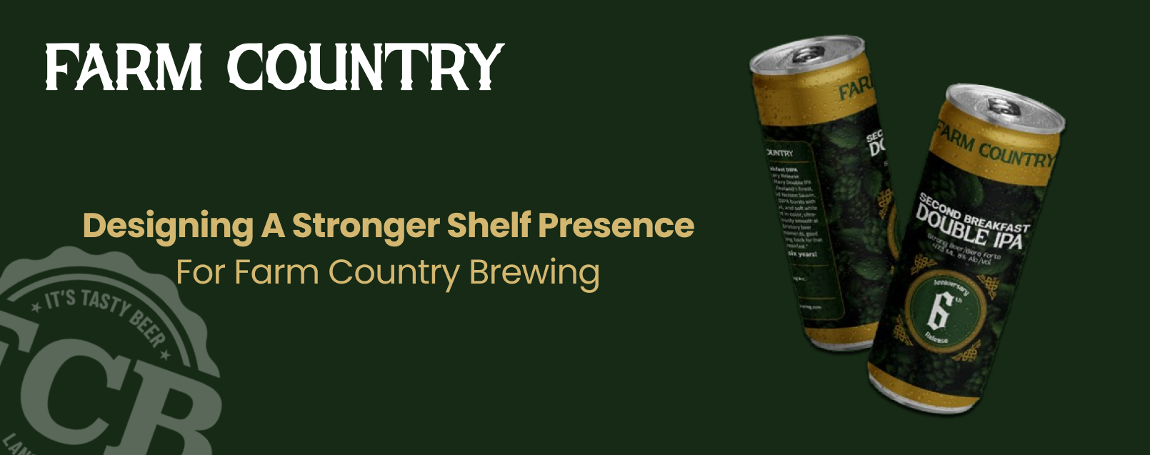
Packaging Design for Beers
Beer cans were treated as a primary brand touchpoint. The packaging system was designed to be bold, recognizable, and easy to extend across different beer styles while maintaining a unified look.
Packaging design focused on:
- Clear brand visibility on shelves
- Consistent layout structure across variants
- Color-led differentiation for easy identification
- A balance between craft authenticity and modern appeal
This system allows new beers to be launched without redesigning from scratch.
Brand Guidelines
To ensure long-term consistency, we created a comprehensive brand guideline covering logo usage, color palette, typography, and application rules. This enables the Farm Country Brewing team to confidently apply the brand across future touchpoints without dilution.
The Outcome
The refreshed brand identity gives Farm Country Brewing a stronger, more confident presence both on shelves and across physical and digital spaces.
The brand now has:
- A refined logo system built for versatility
- Cohesive, recognizable beer packaging
- Clear guidelines for consistent brand usage
- A visual identity that reflects both heritage and growth
The result is a brand that feels established, intentional, and ready to scale.
Services Delivered
- Brand identity refresh
- Logo redesign and variations
- Beer packaging design system
- Color palette and typography definition
- Comprehensive brand guidelines
Need branding that grows with your product?
Let’s build a system that lasts
.webp)