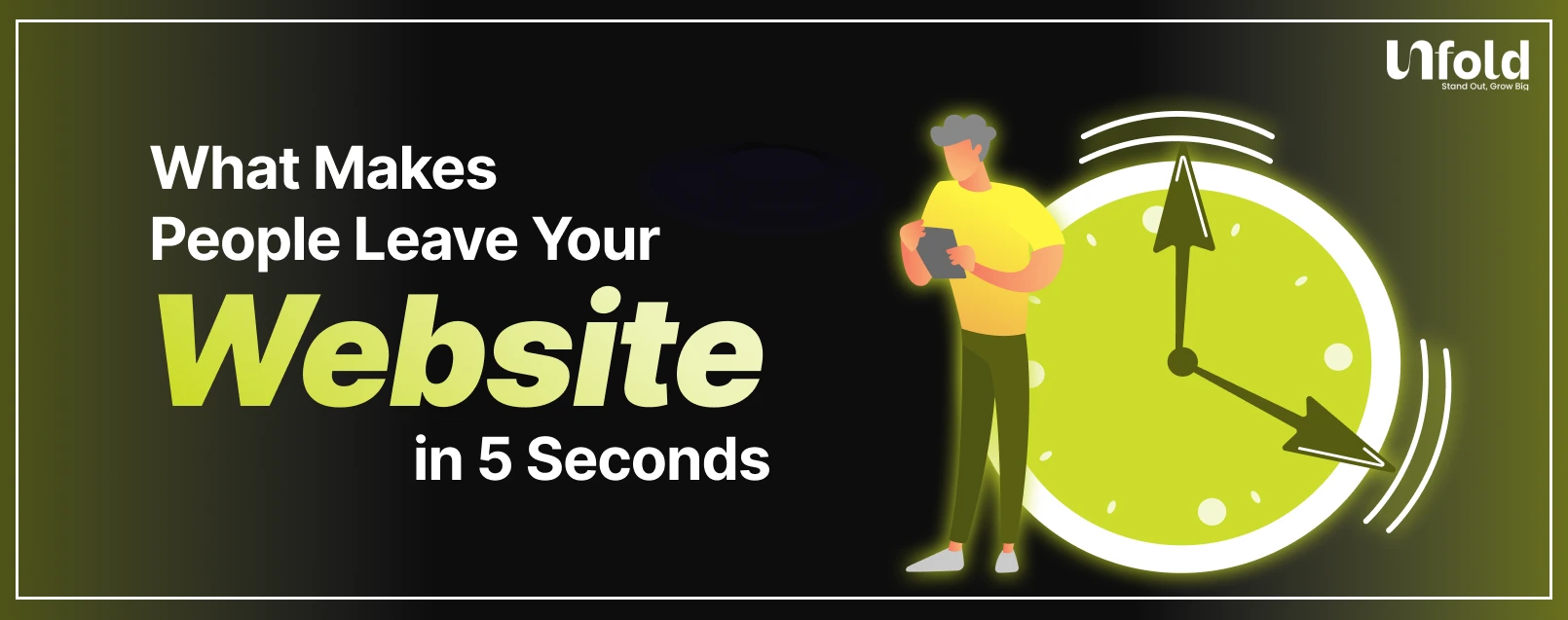
What Makes People Leave Your Website in 5 Seconds?
You worked hard to bring people to your website.
Ads, SEO, social media, referrals. The traffic is there. But most visitors leave almost instantly.
Not in minutes.
Not after scrolling.
In five seconds or less.
This is not because users are impatient. It is because your website failed to answer one simple question fast enough:
“Is this for me?”
If the answer is not immediately clear, people leave. Understanding why this happens is the first step to fixing it.
The 5 Second Rule of Websites
Research consistently shows that users form an opinion about a website almost instantly. Within a few seconds, they decide whether to stay or leave.
In those first moments, visitors are not reading paragraphs or analyzing features. They are scanning.
They are looking for:
- Clarity
- Relevance
- Trust
- Ease
If your site feels confusing, slow, or untrustworthy, they do not wait around.
First impressions decide everything.
What the 5 Second Test Really Measures
The famous 5 second test is not about design beauty. It measures comprehension.
After five seconds, a user should be able to answer:
- What does this company do?
- Is this relevant to me?
- What should I do next?
If users cannot answer these questions quickly, the website has already failed, no matter how good the product is.
Most high bounce rates are clarity problems, not traffic problems.
Unclear Value Proposition
This is the biggest reason people leave.
If your headline is vague, clever, or filled with jargon, users will not work to understand it.
Statements like:
- “Innovating the future of digital solutions”
- “Empowering growth through technology”
- “A platform for next-generation success”
Mean nothing to a first-time visitor.
Your value proposition must clearly explain who you help and how in one glance. If users have to scroll to understand what you do, you are already losing them.
Poor Visual Hierarchy and Design Overload
When everything screams for attention, nothing gets attention.
Many websites overwhelm users with:
- Too many colors
- Multiple competing headlines
- Excessive animations
- Large blocks of text
- No clear focal point
This creates cognitive overload.
Users should immediately see:
- A clear headline
- A supporting explanation
- A primary call to action
If the eye does not know where to go first, the user leaves.
Slow Page Load and Performance Issues
Speed is non-negotiable.
If your website takes more than a few seconds to load, many users will leave before they even see your content. This is especially true on mobile.
Slow sites signal:
- Poor quality
- Outdated technology
- Lack of professionalism
Even a great design cannot compensate for slow performance. Speed is part of user experience, not a technical detail.
Lack of Trust Signals
Visitors are cautious.
They do not know you. They do not trust you yet. If your website does not help them feel safe, they leave.
Common missing trust signals include:
- No social proof
- No client logos or testimonials
- No clear about page
- No contact information
- No credibility indicators
People look for reassurance subconsciously. Without it, hesitation turns into exit.
Mismatch Between Ads and Landing Pages
If users arrive from an ad or search result and the page does not match their expectation, they bounce immediately.
This happens when:
- The headline does not reflect the ad message
- The offer feels different
- The intent changes from informational to sales-heavy
- The design feels inconsistent
This breaks trust instantly.
Message continuity between traffic source and landing page is critical for retention.
Poor Mobile Experience
Most traffic today is mobile, yet many websites are still designed desktop-first.
Common mobile issues include:
- Text that is too small
- Buttons that are hard to tap
- Content cut off or misaligned
- Slow mobile load times
- Popups covering the screen
If mobile users struggle even slightly, they leave. They will not pinch, zoom, or fight your layout.
Mobile experience is first impression experience.
Aggressive Popups and Interruptions
Nothing frustrates users faster than being interrupted before they understand the page.
Popups that appear immediately asking for:
- Email signups
- Cookie consent overload
- Chat prompts
- Discounts
Disrupt the natural flow.
Before asking for attention, you must earn it. Early interruptions feel pushy and desperate, which drives people away.
Confusing Navigation and No Clear Next Step
Even if users like what they see, they may still leave if they do not know what to do next.
Common issues include:
- Too many menu items
- Vague navigation labels
- No primary call to action
- Multiple competing CTAs
Users do not want to think. They want guidance.
A clear path forward keeps users engaged beyond the first few seconds.
How to Diagnose 5 Second Drop-Offs
To fix fast exits, you need to observe behavior, not guess.
Useful methods include:
- Heatmaps to see where users focus
- Session recordings to watch interactions
- Analytics to identify high bounce pages
- The 5 second test with real users
Ask testers one question:
“What do you think this website is about?”
If their answer does not match your intention, you have found the problem.
Quick Fixes That Improve First Impressions
You do not always need a full redesign.
High impact fixes include:
- Rewrite your main headline for clarity
- Simplify the above-the-fold section
- Remove unnecessary elements
- Improve contrast and readability
- Add one strong trust signal
- Delay popups
Small clarity improvements often deliver big results.
Why Clarity Beats Creativity in the First 5 Seconds
Creativity matters, but only after clarity.
Users do not reward cleverness if they are confused. They reward understanding.
The first five seconds are about answering basic questions. Creativity shines later, once trust is established.
The best websites feel obvious, not impressive.
Conclusion: People Leave Because You Did Not Make It Easy
Users do not leave because they are impatient.
They leave because:
- They do not understand you
- They do not trust you
- They do not know what to do
Fix those three things, and bounce rates drop naturally.
Your website does not need to say everything fast.
It just needs to say the right thing fast.
Want to get an Audit?
If users are leaving your website in seconds, the problem is not traffic.
It is experience.
At UnFoldMart, we help brands fix clarity, trust, and UX issues that silently kill conversions.
👉 Get a website UX & conversion audit and turn visitors into customers.
.jpeg)


FAQs
Got Questions? We’ve Got Answers – Clear, Simple, and Straight to the Point
Yes. Clear design, strong visual hierarchy, and simple navigation help users stay longer and take action more easily.
Page speed is extremely important. Even a one or two second delay can significantly increase bounce rates, especially on mobile devices.
A good bounce rate depends on the site type, but generally anything between 40% and 60% is considered healthy for most websites.
People leave quickly when they do not understand what the website offers, do not trust it, or feel confused about what to do next.

Want to Turn Your Brand Into a Scalable Growth Engine?
We help modern businesses unify branding, websites, SEO, and paid media into one performance-driven system designed to scale.